Project:
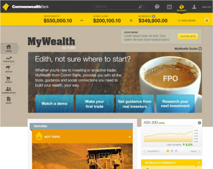
Commonwealth Bank of Australia started a new division called MyWealth that brought the trading of shares, properties, and other investments to the regular retail banking customer.
The concept designed in both in Sydney and San Francisco with an evolving business unit that was started along with the design of the product.
Key Challenges:
- Make trading, retirement, and property investment easy to learn and do
- Design using an agile process with a team in another country
Role:
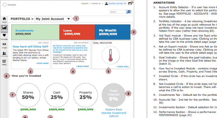
A varied UX team was used over the year and a half with CBA of which I was the only consistent member from the agency. My work provided consistency and detailed annotations as well as designing the specifics for the Invest section of the site.

Tiles and rows were a primary UI element that displayed investments more like products that one might see in an e-commerce site to make the process of buying and selling shares more friendly to the novice investor.

Circular charts of your whole wealth was the primary component for the portfolio to allow users to see a broad picture of their investments. The user may also add investments from other banks or companies to give the user a centralized place to see their entire wealth.

Investments were constructed in the fashion of a product detail page where large hero images and ample white space for numbers made a friendlier design for each company.

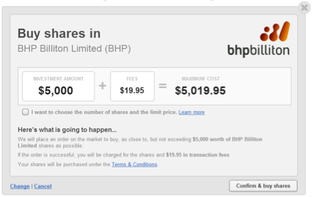
Simple controls and consumer friendly language spell out the process for trading shares.

Prototypes in the software Axure were created to conduct usability testing for each stage of the project. The test protocol and all the pages were created in San Francisco and administered by a 3rd party research team in Sydney.
Screen sharing using GoToMeeting was used for observation and live commenting during the tests.