Project:
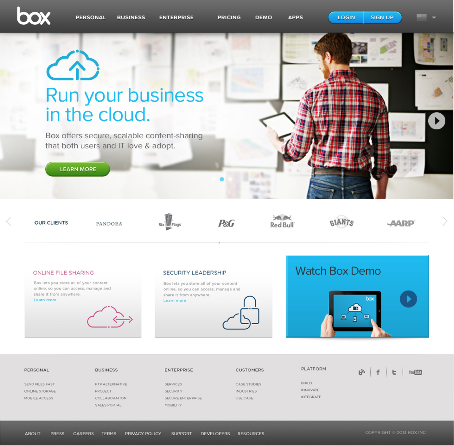
Succinct messaging and streamlining of content were primary drivers of the Box.com redesign. This project took a 2000 page site and redesigned that content in 200 pages. Individual features that had their own page were consolidated into broader solutions pages and industry specific content.
Key Challenges:
- Create a responsive site across mobile, tablet, and desktop
- Define succinct messaging and content that customers can easily read & scan
Role:
My primary role on this project set the content & site structure and facilitate those changes with the client marketing team. I managed one UX designer in wireframing the site as well as guiding the client’s visual design team in responsive page layout.

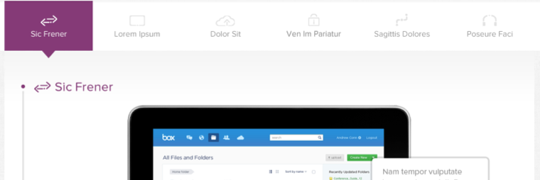
A page level navigation was introduced to let users quickly identify the content on long vertical pages and jump down to relevant content. The bar would lock to the top of the page giving the users easy access to jump around and to know how much content was remaining.

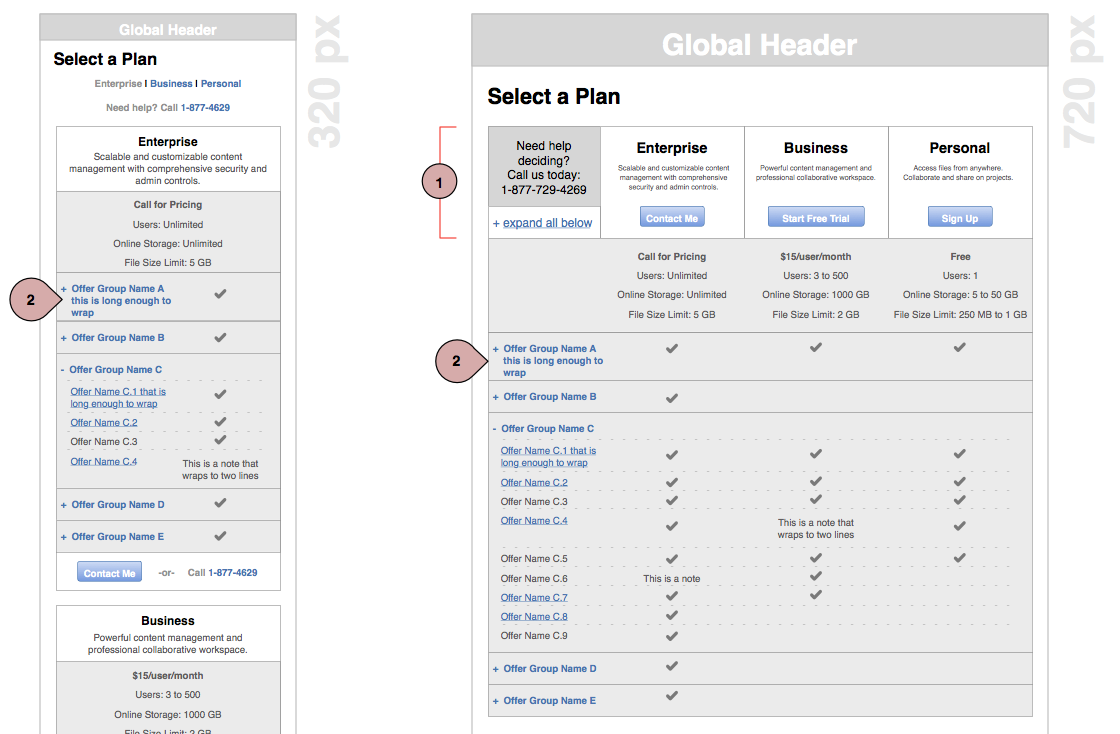
The responsive web design process used 3 different resolutions defined by using looking at the current web statistics and the devices hitting the site today as well as the popularity of various mobile devices. The design templates placed the 3 resolutions on the same page so all 3 resolutions would be considered concurrently.
